Monday, October 29, 2012
Tuesday, October 23, 2012
Friday, October 12, 2012
Sunday, October 7, 2012
Logo Project
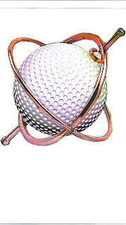
My reasoning behind the gyroscopic golf logo design is that
golfers would love a golf ball, golf clubs and training aids that would help
them control the golf ball. The visual image of a gyroscopic golf ball is a dream
comes true for golfers. If the ball starts to fly right or left of target the
ball automatically corrects itself and fly’s straight. My training aids and
even golf clubs are designed with gyroscopic technology that makes golfers
swings perfect. The idea of the logo is
to illustrate the concepts of my golf training aid company. The mission of my
company is to create products that help golfers hit the golf ball straight.
The choice of red coloring for the company name is because
red signifies shooting under the golf holes U.S.G.A. standard or par, and signifies excellence
in scoring. The choice of blue for the gyroscopes rim signifies true blue in
product excellence and performance.
Wednesday, October 3, 2012
Sunday, September 23, 2012
Project 2: Logo Part 1
ARC
ANGEL GOLF TRAINING AIDS, INC.
-ALIGN A PUTT - PUTTING TRAINER
-ARC ANGEL - SWING ARC
BULDER >“Endorsed by God”
-GYROSCOPIC PIVOT
TRAINER
-TURN IN A BARRELL
ROTATOR
-THE STRAIGHT JACKET
SWING CONNECTOR
THE
WORLDS BEST GOLF TRAINING AIDS!
Critiqing Logo's
Dell computers have a strong logo with its “E”
in a shape of a diamond and with two black lines. Its visibility is simple;
when it is shrunk down and or put on a computer it is still obvious that it is
a dell logo. It also has strong durability by having this logo since the
company first started and made it known by commercials and labeling it on front
of computers.
Sony’s visibility is strong because
when it is shrunk down to fit on products it is still visible to be known as a
Sony product. Sony has strong durability and a made a well-known name for
themselves in electronics.
Harley Davidson has a strong logo
and is recognized by the colors used outlining the logo. When it is shrunk down
it would still be recognized by the bright orange and the shapes used. Harley Davidson
is known for their motorcycles, trucks, and other products such as clothing.
Virgin Mobile made a strong logo by having an oblique circle
and an oval shape intersecting through it. It is durable and if it is shrunken
down the hot pink is still noticeable with the odd shaped “V” and the line underneath
it makes this logo its own for Virgin Mobile.
Southwest Airlines has a strong
logo due to its bright colors such as blue and red filling in the airplane and
with the capital bold letters. I don’t think the words will be as visible when it’s
a smaller size but the airplane would. Its durability is strong also because
Southwest Airlines has had this logo since the beginning. Its usability can be
useful on airplane tickets, traveling websites, and actual airplanes.
Subscribe to:
Posts (Atom)


 Reference.
 Used as a reference


